Commercial Pilot Workflow Application (EFF)

Project Overview

Project Overview

EFF is a pilot-focused digital system designed to simplify how commercial pilots access real-time flight data and manage critical workflows. Existing tools were fragmented, manual, and often increased cognitive load during high-pressure situations. The goal was to design a clear, reliable interface that supports faster and safer decision-making across different flight phases.

EFF is a pilot-focused digital system designed to simplify how commercial pilots access real-time flight data and manage critical workflows. Existing tools were fragmented, manual, and often increased cognitive load during high-pressure situations. The goal was to design a clear, reliable interface that supports faster and safer decision-making across different flight phases.

Responsibilities

  • User research and workflow analysis

  • Experience strategy and interaction design

  • Prototyping, iteration, and validation

  • Alignment with aviation standards

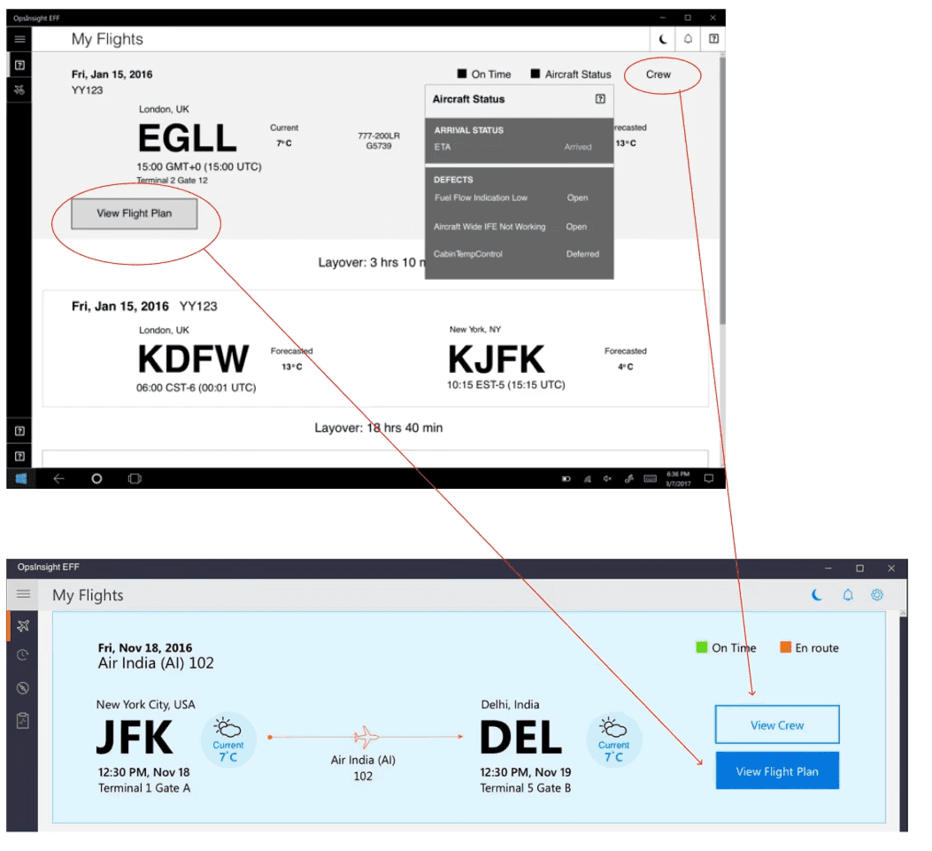
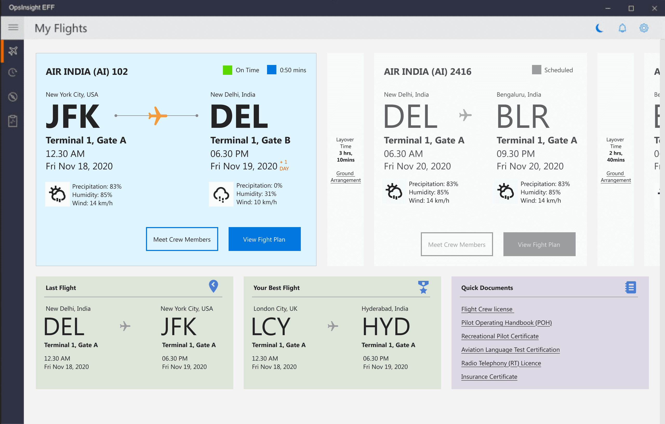
Outcome: iOS 7 Windows App

Impact

Impact

After two quarters, the client has begun incorporating additional features, during this period, the matrix appears as follows:
For more info, Please download client's data sheet in their official website

After two quarters, the client has begun incorporating additional features, during this period, the matrix appears as follows:
For more info, Please download client's data sheet in their official website

300+ Users
Onboarded in 2Q

300+
Users Onboarded in 2Q

76%
Adaptation Rate

76%
Adaptation Rate

84%
Task Competition Rate

84% Task
Competition Rate

90%
User Engagement

90%
User Engagement

Challenge

Challenge

Pilots depend on fragmented systems and manual checks to manage flights, which slows access to critical data like weather and fuel. This adds cognitive load and increases risk during high-pressure moments.

Final UI Design

Final UI Design

Card Design -Light Theme

Card Design- Dark Theme

Research & Understanding

Research & Understanding

To understand pilot needs and constraints, we conducted interviews and surveys with commercial pilots across different experience levels.


To understand pilot needs and constraints, we conducted interviews and surveys with commercial pilots across different experience levels.


What we focused on

  • Pre-flight preparation and time pressure

  • In-flight access to critical data

  • Manual steps and workarounds

  • Information overload and context switching

What we focused on

  • Pre-flight preparation and time pressure

  • In-flight access to critical data

  • Manual steps and workarounds

  • Information overload and context switching

Key research insight.
Pilots needed faster access to the right information at the right moment, without navigating complex menus or switching between tools.

Key research insight.
Pilots needed faster access to the right information at the right moment, without navigating complex menus or switching between tools.

Key Insights

Key Insights

From research synthesis, three clear insights emerged:

From research synthesis, three clear insights emerged:

Time is limited
Pilots often have very little time for pre-flight preparation and need information instantly.

Cognitive load is high
Managing multiple tools and data sources increases mental effort, especially during critical flight phases.

Context matters
Pilots need different information during pre-flight, taxi, take-off, cruise, and landing. Showing everything at once creates clutter and confusion.

Key insights from interviews and secondary research

  • Planning a trip often feels confusing and spread across too many apps.

  • When travellers reach a new place, they’re often not sure where to start.

  • Language barriers and limited context make it harder to feel confident and engaged.

User interviews and secondary research helped us understand how travellers plan and explore trips, we found that planning feels scattered, information on location is hard to find and language barriers often reduce confidence while exploring.

User Interview with Travellers

Abhishek

"I usually feel overwhelmed while planning trips. There’s too much information, and I’m never sure if I’m making the right choices"

Apoorva

"When I reach a new place, I’m not sure where to start. There’s a lot to see, but not much guidance I can easily trust.”

Danish

"While travelling, I prefer exploring at my own pace. Fixed schedules or too many instructions sometimes take away from the experience."

How might we

How might we

Design Rationale

Design Rationale

Design decisions were guided by the key How Might We questions from research.

  • Reduce planning overwhelm by keeping itinerary creation simple, visual, and in one place.

  • Lower anxiety on location through quick, contextual access to information while exploring.

  • Support flexible exploration with self-paced experiences and language-friendly guidance.

  • Prioritise clarity and confidence across the journey with clear layouts and familiar patterns.

These choices prioritise clarity, confidence, and ease of use across the journey.


Opportunities Prioritisation

Opportunities Prioritisation

Itinerary Builder
A timeline-based planner lets travellers add, reorder, and edit stops, the map view helps users understand routes and plan quickly.

AR Camera
The AR camera shows instant information at locations. Clear icons, audio and language support help travellers understand places easily.

Guided Tours
Tours are shown as simple cards with time and language details, audio previews and filters help users choose and explore at their own pace.

Visual & Interaction Design
Clean colours, clear text, and familiar icons keep the experience simple.
Figma prototypes were used to test and refine flows.

Design Decision

Design Decision

Lo-Fi Design

Figma Prototype

Figma Prototype

An interactive prototype showcasing the end-to-end travel flow, including itinerary creation, on-site AR discovery, and guided tours. Built to validate user journeys, test key interactions, and refine clarity, navigation, and decision-making across planning and exploration.


An interactive prototype showcasing the end-to-end travel flow, including itinerary creation, on-site AR discovery, and guided tours. Built to validate user journeys, test key interactions, and refine clarity, navigation, and decision-making across planning and exploration.

Prototype Link

Interface Design

Interface Design

Impact

Impact

Expected 25–35% improvement in planning efficiency and higher on-site engagement, based on research and usability feedback.

Expected 25–35% improvement in planning efficiency and higher on-site engagement, based on research and usability feedback.

Expected 25–35% improvement in planning efficiency and higher on-site engagement, based on research and usability feedback.

Expected 25–35% improvement in planning efficiency and higher on-site engagement, based on research and usability feedback.

Metrics Snapshot

Planning Efficiency
Time taken to create an itinerary and number of edits per trip.

On-Site Engagement
AR camera usage rate and time spent exploring locations.

Tour Discovery & Usage
Guided tour views, audio starts, and completion rate.

Planning Efficiency
Time taken to create an itinerary and number of edits per trip.

On-Site Engagement
AR camera usage rate and time spent exploring locations.

Tour Discovery & Usage
Guided tour views, audio starts, and completion rate.

Retention Signals
Repeat visits, saved itineraries, and feature re-usage across trips.

Offline Usage
Number of users downloading places and content for offline access.

Retention Signals
Repeat visits, saved itineraries, and feature re-usage across trips.

Offline Usage
Number of users downloading places and content for offline access.

Create a free website with Framer, the website builder loved by startups, designers and agencies.